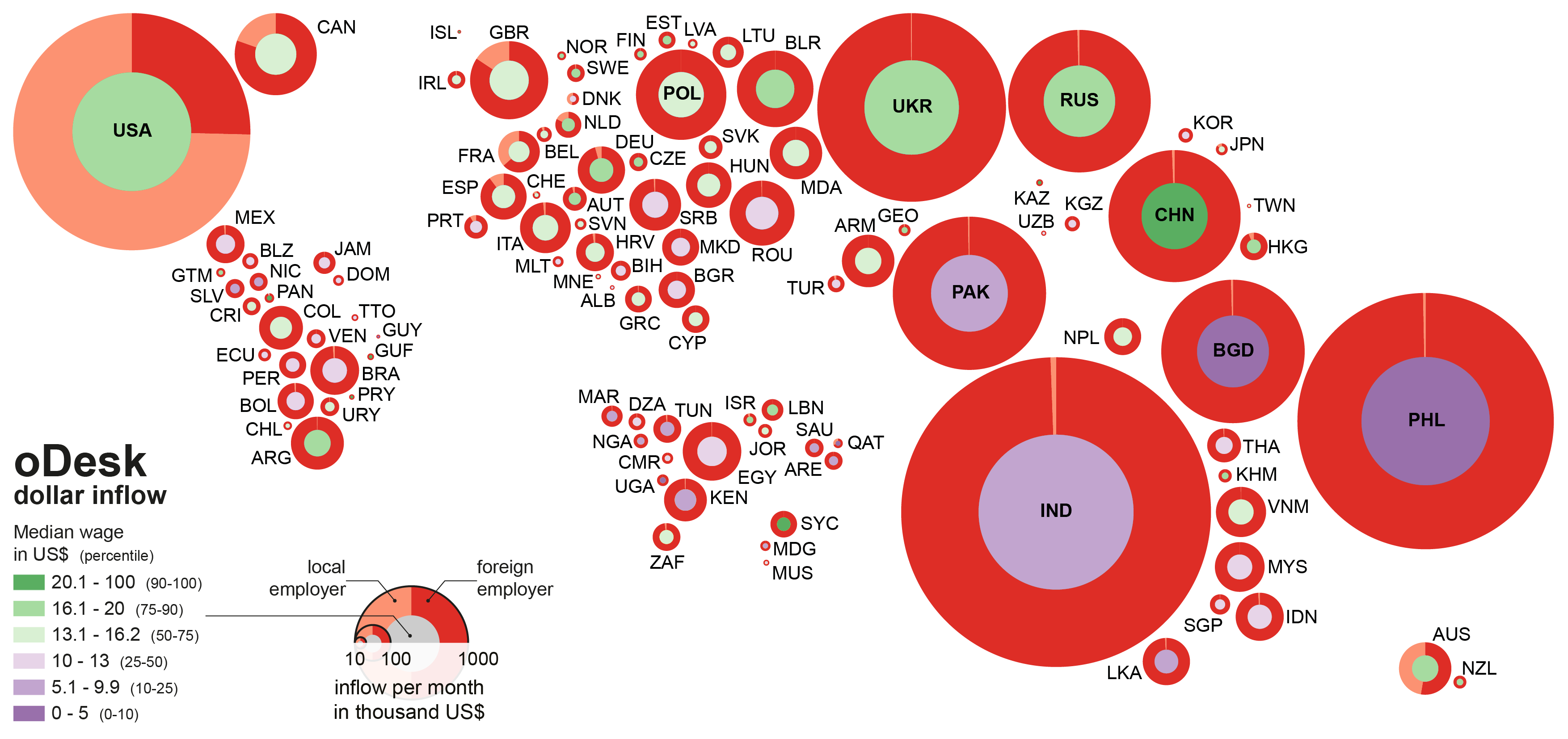
Our previous post contained a few maps that shed light on the geographies of online work. But what we didn’t do there was explore the spatial variance of wages.
The cartogram in this post depicts each country as a circle and sizes each country according to dollar inflow to each country during March 2013 (on the oDesk.com platform). The shading of the inner circle indicates the median hourly rate published by digital workers in that country. The graphic broadly reveals that median wages are, perhaps unsurprisingly low in developing countries and are significantly higher in wealthier countries.
With my colleagues Isis Hjorth, Vili Lehdonvirta, and Helena Barnard, working on a multi-year project on digital labour and development, we’ll have have some research coming out soon that explores some of the reasons why digital workers in the Global South have less bargaining power than their counterparts in the North, and why workers in the North can often attract a premium for their work. The issue is not just a global race to the bottom (which in some ways seems to be occurring), but that there are different price floors for wages in different parts of the world, and there are wage penalties associated with being affiliated with some countries.
(Elance-oDesk Inc. supported this work with their data; our project is funded by the IDRC; also thanks to Stefano De Sabbata, Claudio Calvino, and Sanna Ojanpera for their help with this work)

