Description
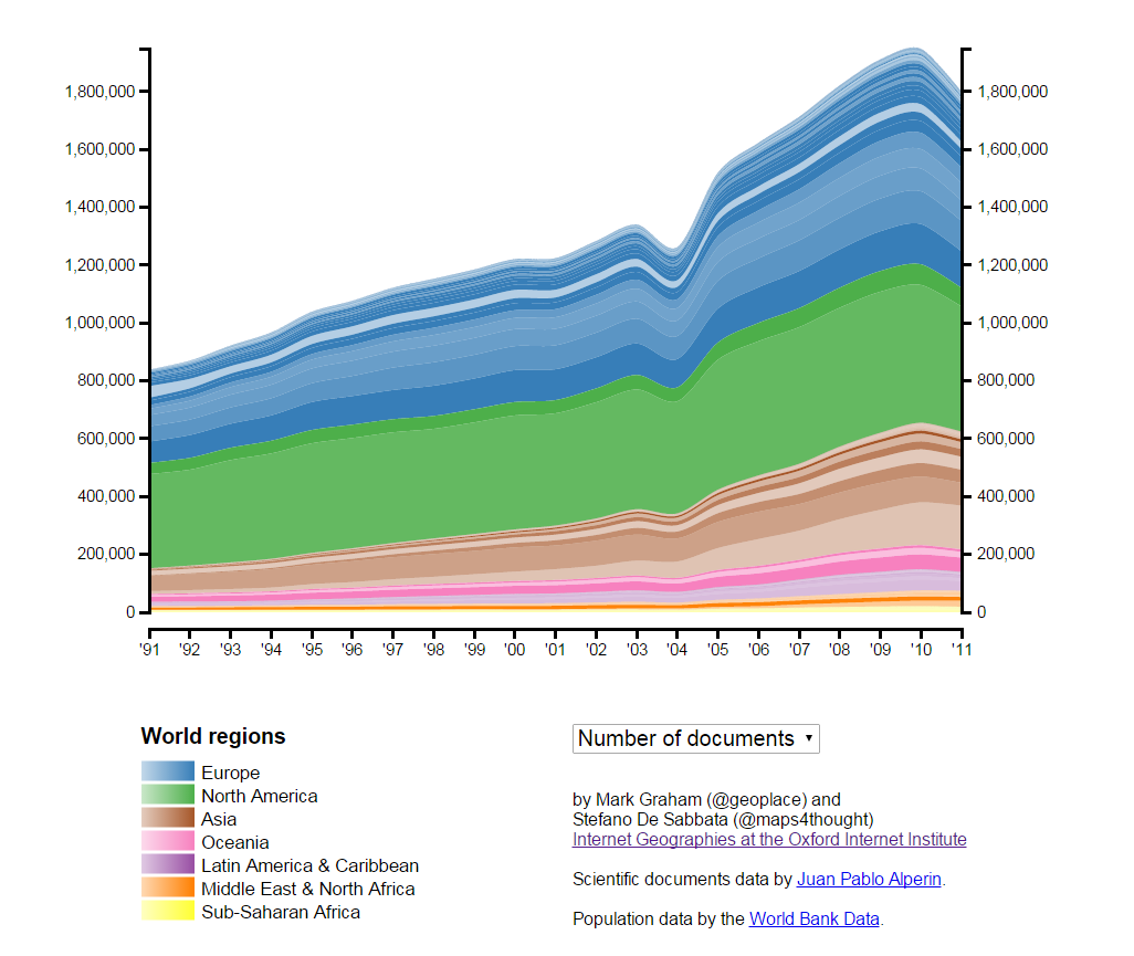
This graph illustrates the number of journal articles produced around the world.
Data
The data used in this graph are from Thomson Reuters’ Web of Science, which “provides access to the world’s leading citation databases” and “includes current and retrospective journal and proceedings data in the sciences, social sciences, arts, and humanities”.
This data represents aggregated numbers of academic documents per country. The stacked area correspond to countries and have been assigned with the colour of the respective world region. Each area is further shaded based on the number of per-capita documents published in the related country. The darker is the shade, the higher the number of documents published per person.
The aggregated data presented in this visualisation have been provided by Juan Pablo Alperin from Stanford University.
Findings
Almost one quarter of all documents in the Web of Science have an author based the in United States. China comes in second, with almost 9% of documents; and the United Kingdom third with 7%.
On a per capita basis, the United Kingdom is punching above its weight with one scientific document produced for every 447 people living in the country (compared to ratios of 1:638 in the United States and 1:9025 in China).
The time series also reveals how the geography of academic knowledge production has changed over the last twenty years. The most striking feature is the stunning growth of Asia in this time span. In twenty years, China jumped from 15th position to 2nd. South Korea moved from 32nd to 11th, and Singapore and Malaysia both gained ten positions.
The overall number of documents listed in the Web of Science from authors based in Asia has more than quadrupled between 1991 and 2011, compared to an increase of 114% worldwide, and a small increase of 36% in North America.
Interestingly, over the same period, we see a noticeable decline in the academic output of Eastern Europe. Russia dropped from 5th to 17th in the rankings. Ukraine, Bulgaria, Hungary, and the Czech Republic similarly all lost more than ten ranks.
Developing countries are massively underrepresented in the Web of Science dataset. All of Sub-Saharan Africa combined accounts for fewer documents than in Poland alone (which ranks 22nd in terms of documents listed on Web of Science). All of Latin America combined is home to about as many documents as Canada (ranked 7th).
Using data provided by the World Bank’s World Development Indicators, it is possible to explore the relationship between the number of researchers in each country, the funds each country devotes to research, and the number of scientific documents produced in each country. These data are available only for 33 countries, but nonetheless offer some useful insights.
Population size, the wealth of a country, and enrolment in tertiary education are positively related to the number of scientific documents in each country. Where available, the number of researchers and the amount of research funding accounts for a sizeable part of the influence of these variables. In other words, we see that the more resources that a country devotes to research, the larger the scientific output of that country will be.
Ultimately what this work shows us is that the majority (66%) of the world’s scientific knowledge continues to be produced in North America and Europe. This dominance has remained fairly stable over time (it was 83% in 1991 and 76% in 2001), despite the rise of Asia (it was 11% in 1991, 15% in 2001, and 23% in 2011). Much of this unevenness can be explained by the total amount of resources that each country devotes to research. However, the net result remains the same. Science is far from being a globally distributed activity.
Cross post from: Geonet: The Geographies of Science
